Editorial Exploration
commercial

RAFAEL SANTA ANA ARCHITECTURE WORKSHOP
Editorial Layout + Typesetting for Architecture Studio, Editorial Design for Digital Publication
Branded Marketing & Business Development Materials: Digital & printed products
Concept: Working within established brand guidelines, I created a range of refined layouts to best showcase the stunning imagery and sophisticated architectural lines that typify the RSAAW Studio work.
Copyright for all photography belongs to RSAAW.
Status: Complete.
Origin: RSAAW
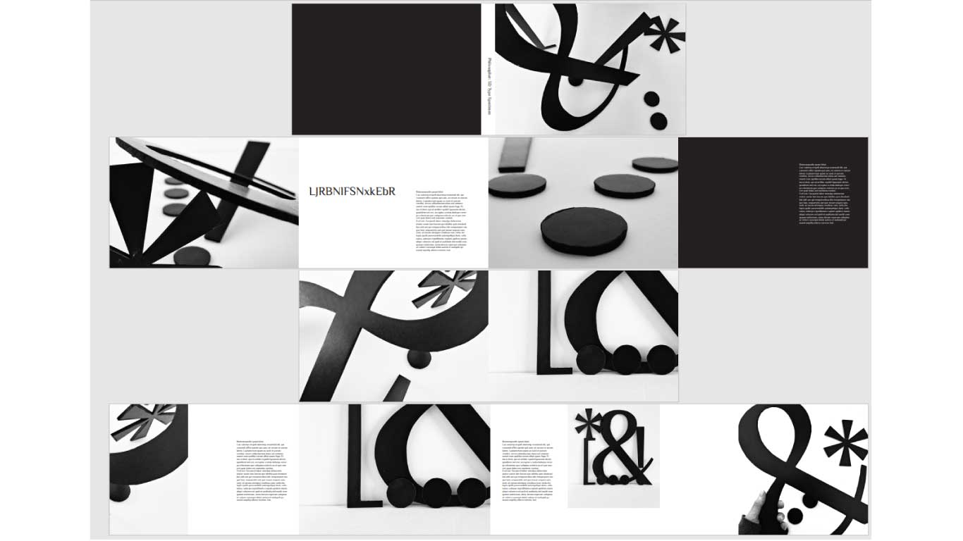
TYPE SPECIMEN (WIP)
3D Design, Type Specimen, Layout, Photography
Type Specimen: Publication / editorial design exploring typographic possibilities of the Philosopher typeface.
Concept: Based on my large scale lettering from the same typeface, and my own photographic shoot, this is a work in progress publication exploring editorial layouts. The aim is to explore the conventions of a Type Specimen with these 3D pieces, looking to see how typography can be brought outside the page, to have interaction with it, and then how this all fits within traditional typographic formats.
Status: Design Development.
Origin: Self-initiated.
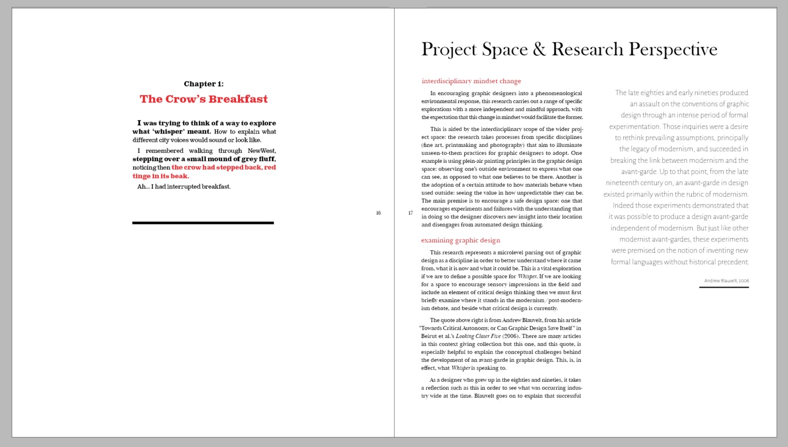
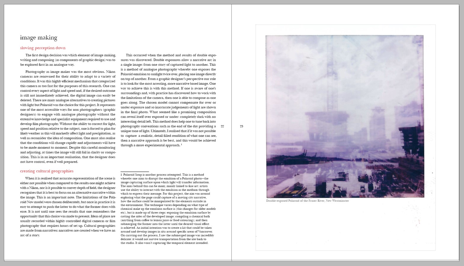
MASTER OF DESIGN: WHISPER THESIS
Book Design, Typeface, Graphic Design Design Research
Whisper Thesis: Master of Design Thesis
Concept: The design of my thesis document was grounded in providing a document that the reader would want to read like a novel, to sit down with and absorb. In much the same way that I intended my Street and Sky Stories books to encourage the reader to get lost in the city, with these book prompts encouraging them to reflect on the stimulation around them, so my thesis document was intended as a reflective document to sit with. This informed the fully justified text and Baskerville typeface choice.
Status: Complete.
Origin: Master of Design.
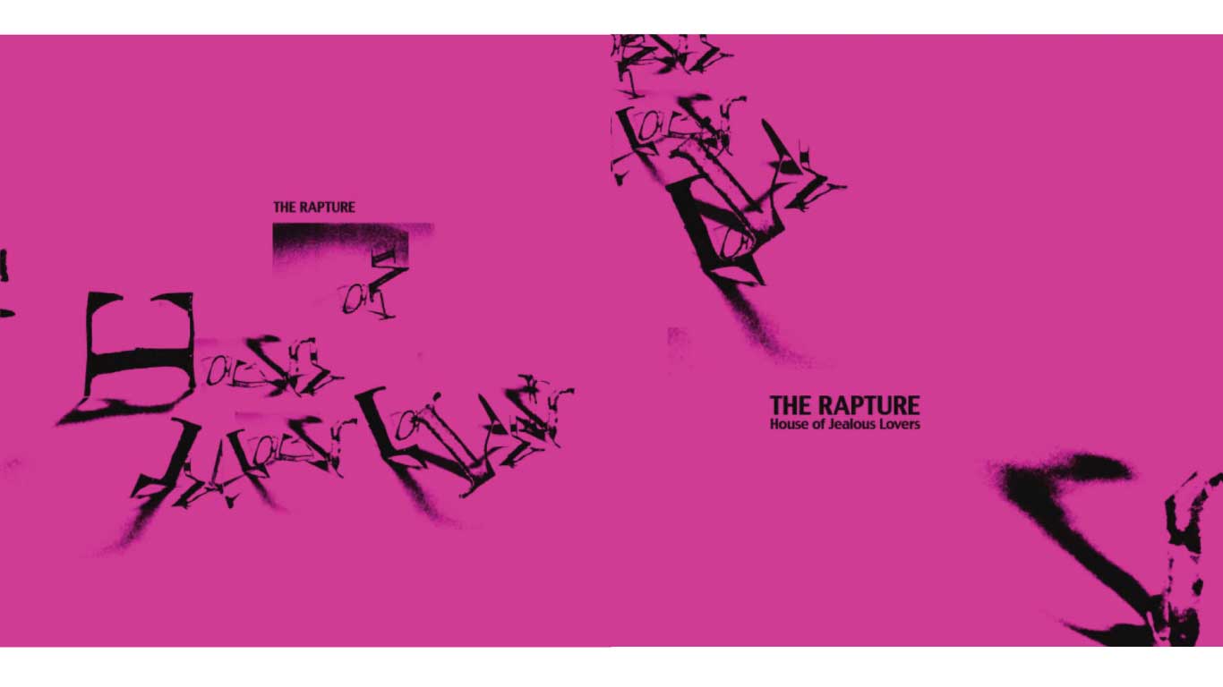
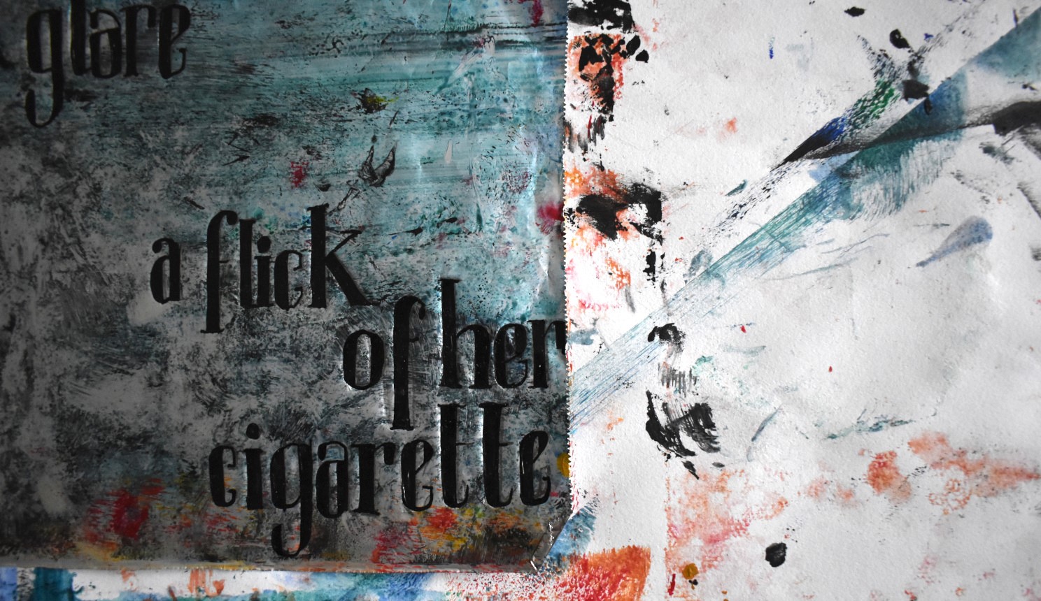
HOUSE OF JEALOUS LOVERS: THE RAPTURE
Typeface Design, Album Cover, Photography
House of Jealous Lovers: Album Cover.
Concept: The design of my thesis document was grounded in providing a document that the reader would want to read like a novel, to sit down with and absorb. In much the same way that I intended my Street and Sky Stories books to encourage the reader to get lost in the city, with these book prompts encouraging them to reflect on the stimulation around them, so my thesis document was intended as a reflective document to sit with. This informed the fully justified text and Baskerville typeface choice.
Status: Complete.
Origin: BA Hons Visual Communication.
All concepts, imagery and wording © Isla Pedrana 2023